Unique Factory Only Focused On
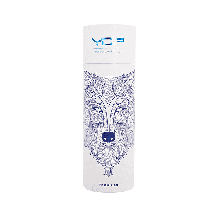
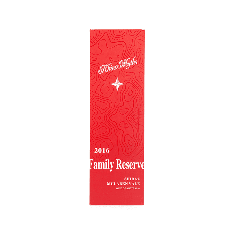
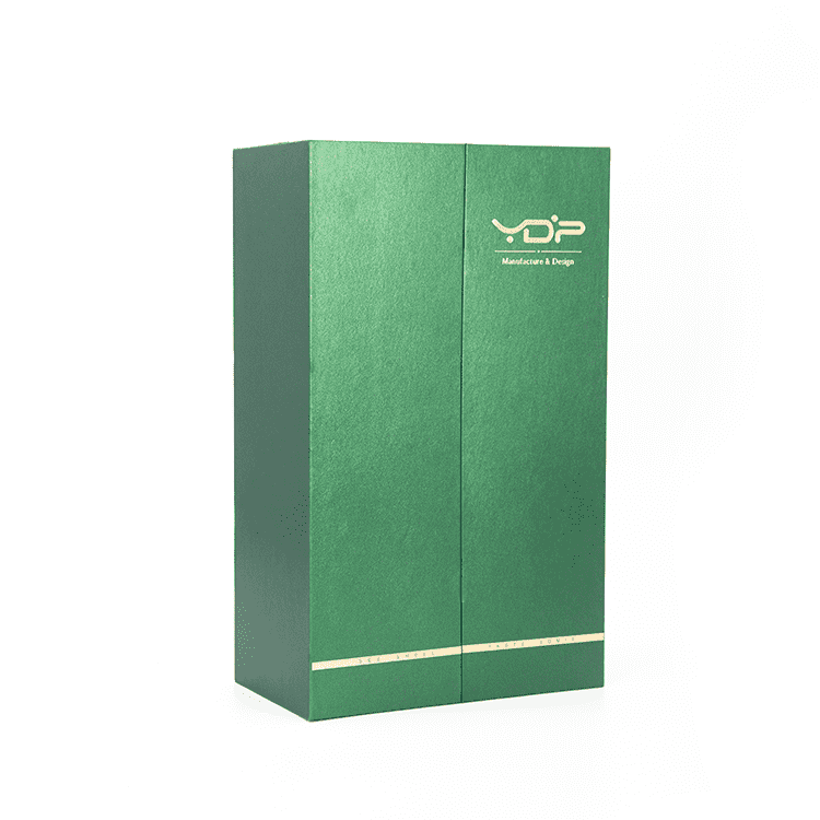
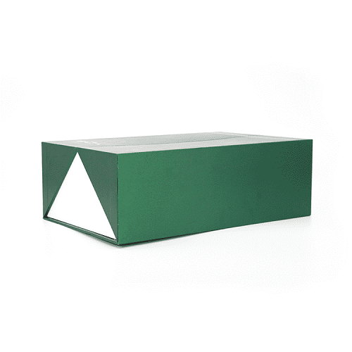
Wine Box
 admin
admin  2025-06-13
Now on the market a lot of commodity has a variety of packaging, but for thousands of products, when the wine box packaging design is very important, is also a special being valued, beautiful and easy wine box packaging design requirements, meet people's aesthetic view, this will depend on the color design and deployment, so wine box packaging design how to design the colour of the carton packaging?
The most important thing is the color of the carton. Color is the color equipment on the picture has the general tendency, the general mood, is the main color of a group of colors, and occupies the absolute advantage in the whole picture printing technology. Wine box packaging planning requires in the remote shelf from the moment of visual excellence, to convey product information, which requires a strong sense of color to cooperate with the printing market.
Therefore, the key to packaging color planning is color planning equipment supplies. The color planning requirements are consistent with the main function of the product. The color planning requirements are consistent with the age, with the preference of different regions and different nationalities for the color. We should be able to get used to this change and conform to the trend of the age. Moreover, is the color of each other contrast and foil. Two colors on the top of each other are called contrast colors, which have the largest difference in hue lightness, leaving a bright and intense sense of contrast to print things. Only by contrast, can the correct expression of the image of the printing union.
Where there is contrast, there is harmony. Two nearby colors are called harmonic colors for printing things. The color and give a person with beautiful, rich, elegant, pleasant, comfortable feeling. Another important aspect of color is rhythm. People often say that music has a rhythm. Why does color have a rhythm? Rhythm way of composition is the important factor of feeling, show on the picture, there are many changes, such as strength, light and shade, soft, true and false, and so on, these opposite the replacement, on both sides of the wine box packaging planning is not a brief repetition, but a variety of ways the rhythm of movement, it has both repetition, and developed, and the various aspects of restraining each other, promote each other, expression of natural the printing shop.
The basic requirement of packaging color planning is to deal with the relationship between change and consistency, to seek change in consistency, to seek consistency in change, which is the so-called color rhythm. The color planning of the carton packaging is very exquisite. It is not a simple association that can come up with a good idea for a while. It requires repeated deliberation and sophisticated mastery of color. It is not an overnight task to perfect the packaging of a wine box.
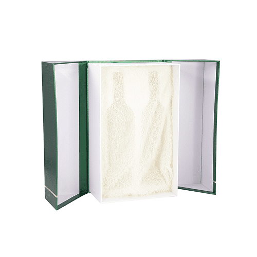
Wine box packaging planning requires humanization. Excellent wine box packaging planning is necessary to get used to the storage, transportation, exhibition and marketing of products as well as consumers with and open, etc.
Therefore, in the planning of wine box packaging, it is necessary to make the share of box structure reasonable, careful structure, exquisite shape, outstanding box shape and raw material beauty, contrast and harmony, rhythm and rhythm beauty, strive to reach the box structure function is complete, exquisite appearance, and then used to produce, sell and even use. The common structure of product packaging box mainly includes hand-held bag type, hanging type, open type, open window type, closed type or a combination of several ways, etc.


Tel: +86 15889632977
E-mail: leo@ydppackaging.com
Room 3806, Block A, Rongde International Building, Henggang Street, Longgang District, Shenzhen, China 518115